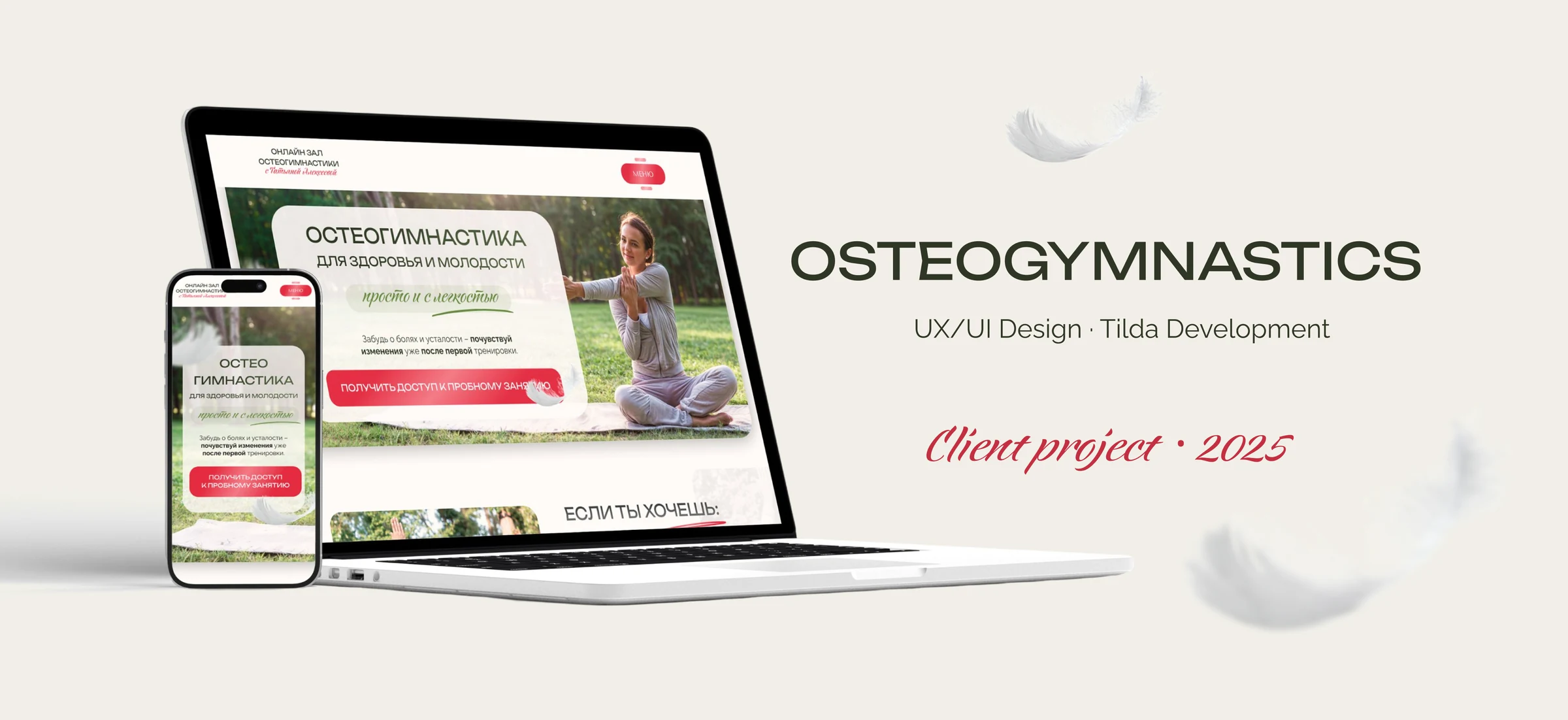
A clear, trustworthy learning and conversion experience for a specialised wellbeing practice.
| Role | UX/UI Designer · Tilda Developer |
| Scope | Discovery, information architecture, UI design, responsive adaptation, Tilda development, domain setup, handoff |
| Timeline | January 2025 – April 2025 |
| Tools | Figma, Tilda, Notion |
| Platform | Responsive one-page website |
A clear and inviting digital home for an unfamiliar wellness practice
I led the project from discovery and information architecture through responsive UI design, Tilda development and handoff. The goal was to turn an unfamiliar wellness practice into a clear, credible and inviting digital experience—while giving the client a website she could update independently.
Click any image to view it at full size.Context
The client was preparing to launch an online osteogymnastics studio. The website needed to introduce the practice, communicate the trainer’s expertise and guide visitors towards a suitable class—while remaining easy for the client to update after launch. An earlier template-based website no longer reflected the new positioning, so we chose a custom design and reorganised the content around a clearer decision-making journey.
The challenge
- Explain an unfamiliar practice. Visitors needed to understand the method before they could evaluate a class.
- Balance credibility and emotion. The experience had to feel light, fresh and feminine without resembling a generic yoga or fitness website.
- Plan for changing content. The schedule, reviews and commercial information needed to remain easy to update.
Discovery and structure
The project began with a discovery call and a review of visual references, preferred palettes and the previous website. I then translated the content into a desktop wireframe and shared it in Figma, where the client could comment directly on each block. The page follows a four-step decision journey:
- Understand — introduce the practice through recognisable visitor needs.
- Trust — explain the approach and support it with the trainer’s expertise and reviews.
- Choose — compare class formats, pricing, schedule and frequently asked questions.
- Act — move naturally towards a trial class, contact form or social channel.
This structure turns a content-heavy subject into a sequence visitors can scan and understand before making a decision.
Visual direction
The brief called for lightness, freshness, femininity and a sense of ease. I explored several directions with different balances of softness, credibility and energy, then refined the concept that felt most distinctive for the studio. To avoid generic wellness imagery, I prioritised the client’s own photography and colour-corrected it to work consistently across the page. A calm neutral base and green accents create a natural, grounded feeling; bright red calls to action add energy and visibility. The feather motif supports the idea of lightness without overwhelming the interface.
The solution
1. Make the unfamiliar understandable
Visitors were unlikely to arrive with a clear understanding of osteogymnastics. I therefore structured the opening around recognisable needs, then introduced the method gradually through short headings, visual grouping and alternating image-and-text sections.
2. Build trust through expertise and real stories
To build trust without slowing down the page, I combined a concise trainer introduction with numerical proof and placed the longer biography behind a “Read more” interaction. Reviews were organised as a slider, keeping social proof visible without letting it dominate the experience.
3. Turn interest into a clear next step
Class formats, pricing, bonuses, schedule and FAQ were brought into one decision-making flow. Calls to action appear only after visitors have enough context, while the final form and social links provide a direct route to contact. As the schedule expanded, I redesigned it as a reusable table rather than a fixed three-day block. This allowed the client to update and publish new classes independently after launch.
4. Keep the experience consistent on mobile
The mobile version was designed as a separate responsive experience rather than a scaled-down desktop page. I reconsidered content order, text lengths, cards, tables, navigation and calls to action for smaller screens and touch interaction.
From design to a live product
I translated the approved Figma direction into responsive Tilda layouts and configured the client’s custom domain. I also prepared the forms, social links, editable schedule and supporting legal pages, then tested the key paths across desktop and mobile.
Handoff and client independence
The final handoff included a structured Notion workspace and a timestamped video guide covering the updates the client would need most often. After launch, she successfully changed and published the schedule herself, confirming that the editing workflow was practical beyond the initial handoff.
Outcome
- The custom responsive website was launched on the client’s domain.
- Three visual directions were explored, with one cohesive system carried through desktop and mobile layouts.
- The client approved the final direction and described the result as lively and colourful.
- The client could update and publish the class schedule independently.
- A structured handoff and video guide made routine website updates manageable without ongoing designer support.